design case study7 weeks

PDP Optimization

I redesigned the product detail page around faster decision-making, clearer product value, stronger trust signals, and a more compact mobile purchase flow.

My role

Interaction designer, UX audit, ecommerce research, wireframing, visual design, stakeholder alignment

Case study
Redesigned Man Matters PDP after optimization
Original Man Matters PDP before optimization
||
Before
After
Drag to compare the original and redesigned first screen.
Impact

+8.2%

Conversion rate

Lift compared with the previous PDP experience.

Impact

+21%

Add to cart

CTR increased from 19% to 23%.

Impact

-14%

Bounce rate

Reduced from 63% to 54%.

Impact

-35%

Scroll effort

Average scrolls dropped from 17 to 11.

Project overview

Mobile PDP redesign for clearer purchase decisions.

Man Matters decided to redesign its mobile-first product description page to create a smoother purchase experience and improve conversion. The product page needed to support product education, trust, upsell moments, and doctor consultation discovery without making users work through a long, scattered page.

Objectives

Reduce decision effort without hiding useful detail.

  • Help users make decisions faster with clear, relevant information.
  • Simplify page content and reduce cognitive load.
  • Boost engagement, improve CTR, increase conversions, and lower bounce rate.
  • Drive more upsells, cross-sells, and doctor consultations.

Impact snapshot

Measured as a product experiment, not a visual refresh.

The redesign was validated through an A/B test and tracked against conversion, engagement, bounce, and scroll-depth behavior.

Audience

30% test group

Duration

3 weeks

Primary metric

Conversion lift

Secondary metrics

Add to cart, bounce, scroll depth
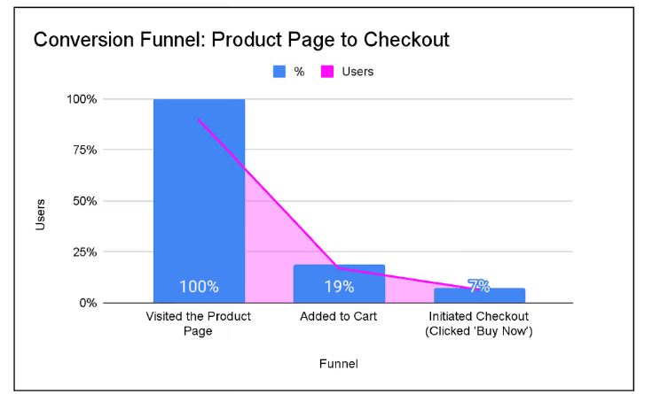
Data signals

  • Close to 19% of users added the product to cart, but only 7% proceeded to Buy Now.
  • The page had a 63% bounce rate, 21% higher than the 52% design benchmark.
  • A significant portion of users spent too much time searching for relevant information.
  • Only 1% of users reached the bottom of the page.

Funnel evidence

Interest was present, but too few users moved from cart to checkout.
Conversion funnel chart showing 100% product page visits, 19% added to cart, and 7% checkout initiation

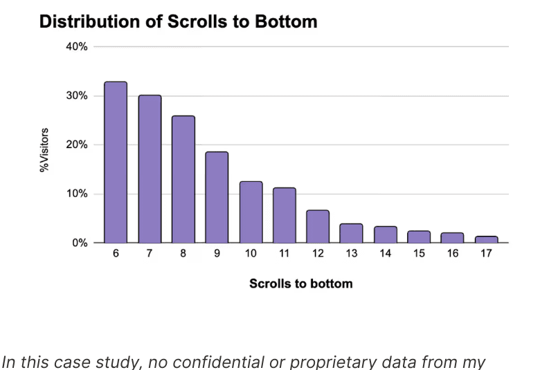
Scroll-depth evidence
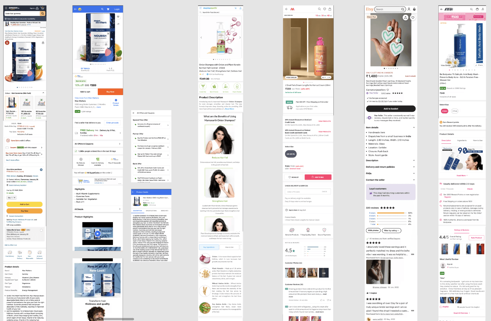
The old PDP required too much effort to finish.
Chart showing distribution of scrolls required to reach the bottom of the PDP

Audit of the current PDP

  • Very limited first-scroll vertical space.
  • App promotions appeared twice in the first scroll and consumed key viewport space.
  • The table of contents felt unorganized in the main viewport.
  • Multiple delivery-date checking options repeated similar jobs.
  • Product images were text-heavy and lacked multiple product angles.
  • The product name was short and did not explain what the product was for.
  • Concern, type, and quantity selectors took too much vertical space.
  • The product description was content-heavy and lacked clear hierarchy.

Competitive analysis

  • Reviewed healthcare-specific PDPs to understand how wellness products explain benefits, usage, ingredients, reviews, and proof.
  • Studied ecommerce PDPs from Amazon and Flipkart because the product was also sold through large marketplaces.
  • Compared how platforms sequence product media, offers, reviews, delivery, variants, product details, and trust signals.
  • Identified before-and-after proof, social proof, and clear benefit modules as important confidence-building moments.
  • Used these patterns to decide which PDP sections were essential, optional, or could be compressed.

Competitor scan

A compact view of the PDP landscape.

The full board is available on demand so the case study keeps its pace, while still showing the breadth of the comparison work.
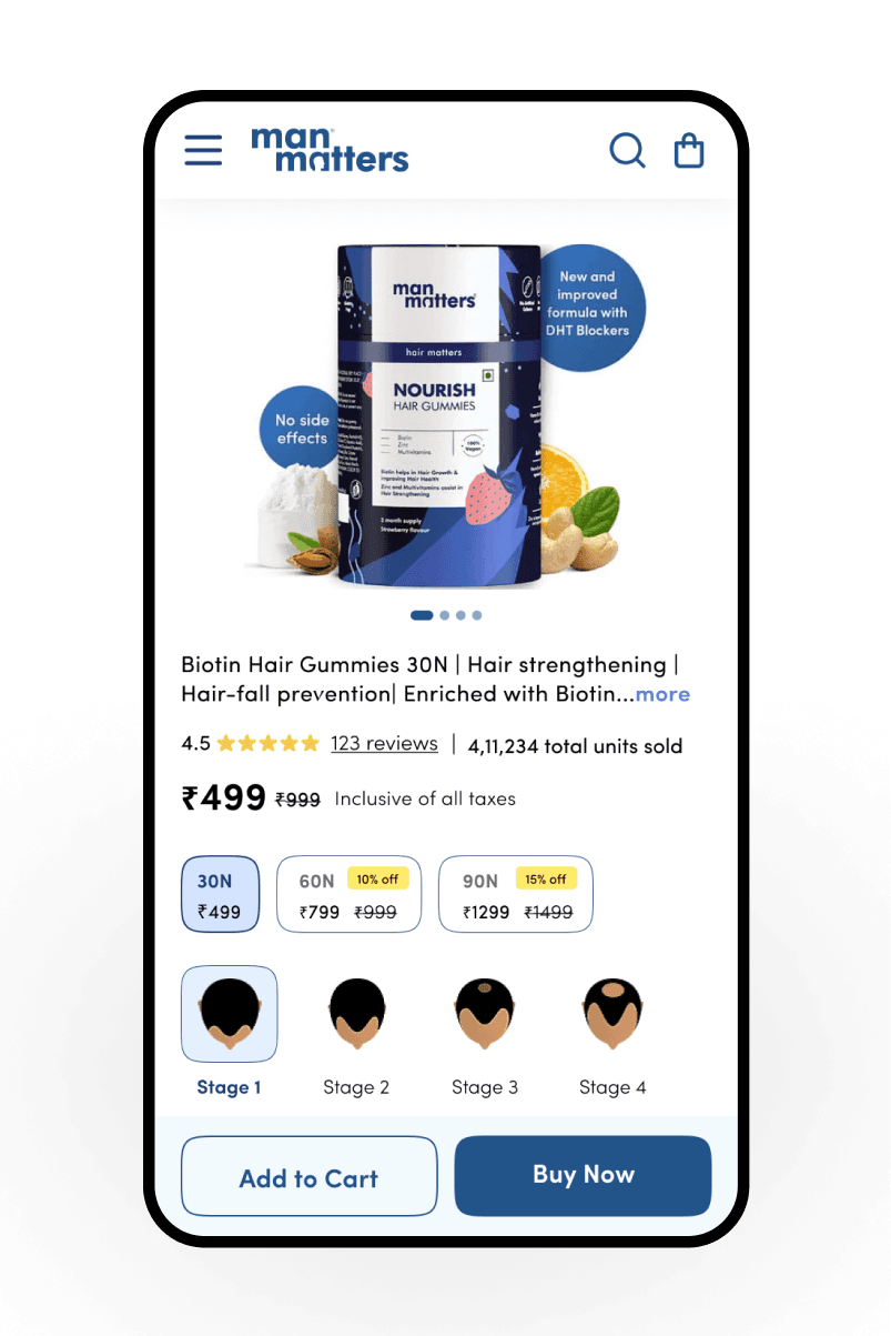
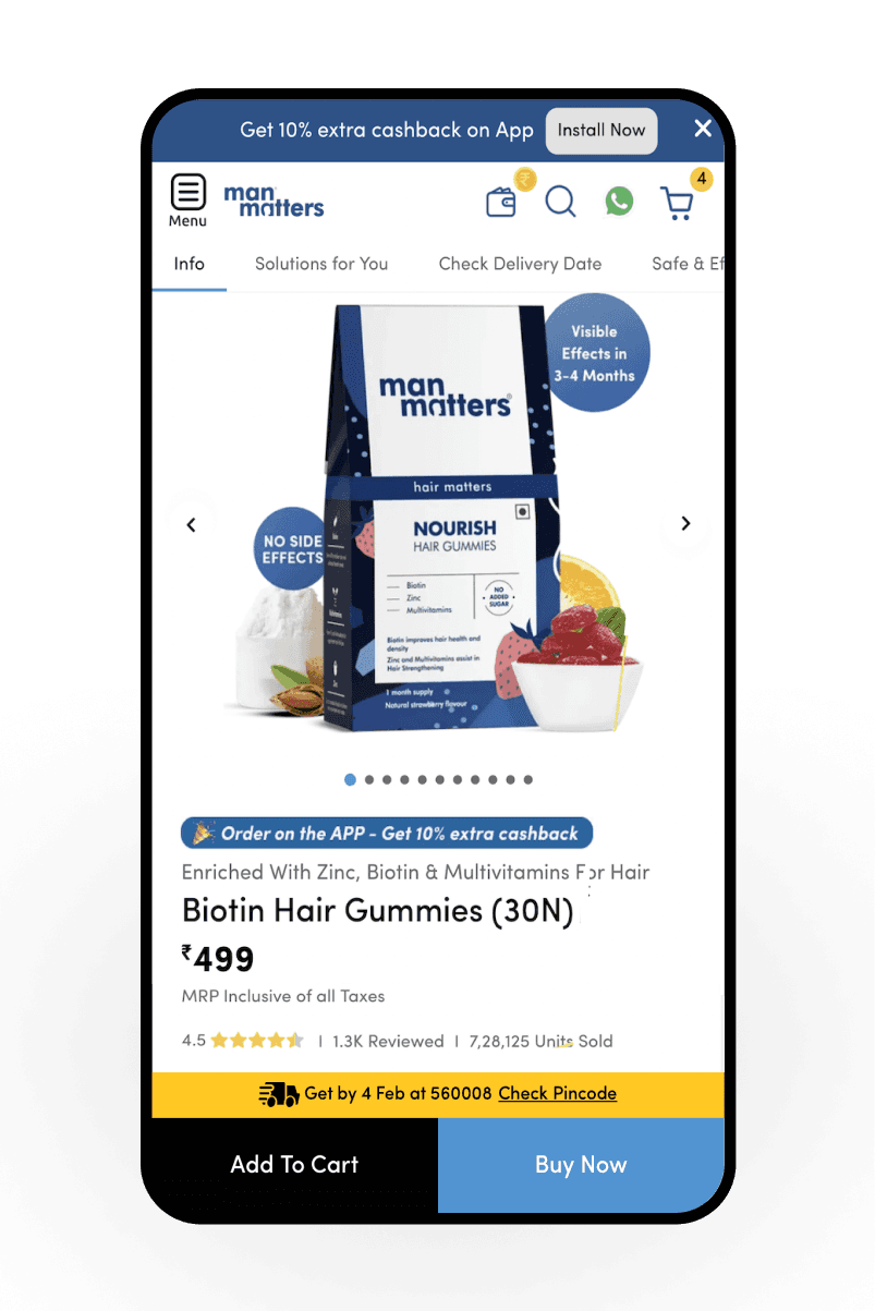
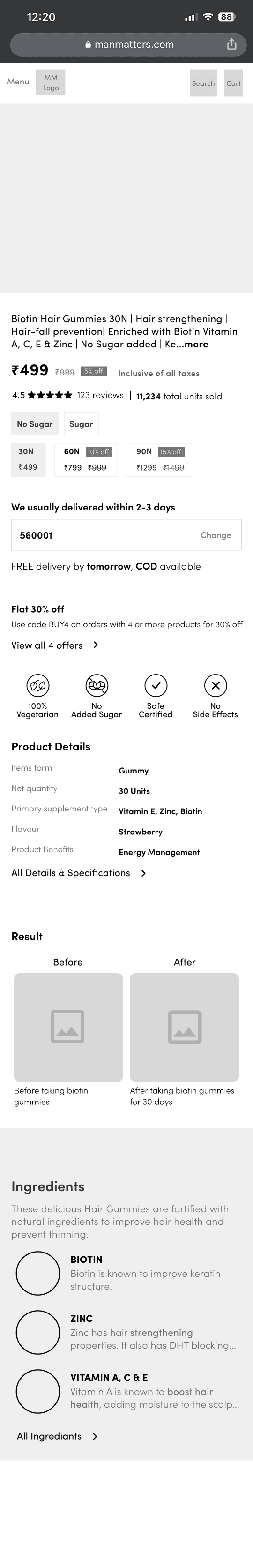
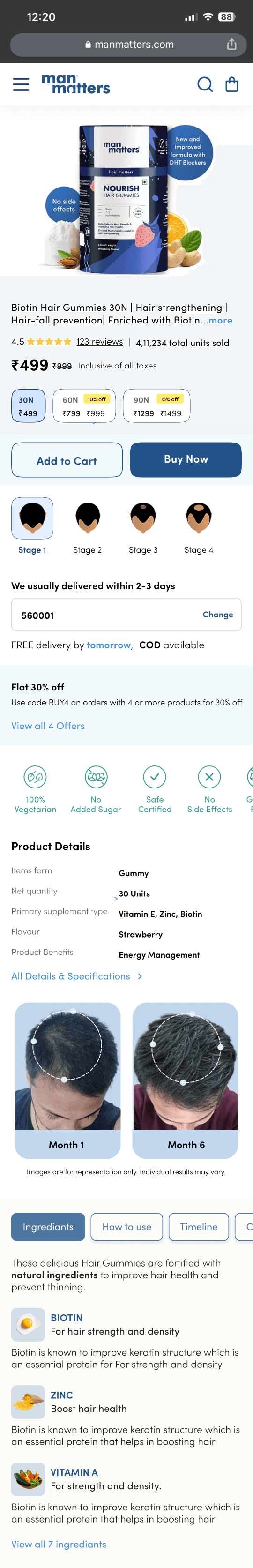
Competitive analysis board comparing PDP layouts across ecommerce and wellness platforms
Competitive analysis board

Before / after

The redesign made the first purchase screen clearer.

The new PDP removes repeated distractions and brings product confidence, variant selection, and primary CTAs into one cleaner mobile decision area.

Before
Original Man Matters product detail page before the PDP redesign
Repeated app promotion, dense navigation, delivery strip, and lower-priority details competed for the first screen.
After
Redesigned Man Matters product detail page after the PDP optimization work
Cleaner product media, clearer purchase actions, variant choices, and concern-stage selection moved into a stronger decision flow.

Research inputs

  • Reviewed healthcare-specific product description pages.
  • Studied Amazon and Flipkart PDP structures because the product was also sold through ecommerce giants.
  • Compared section ordering, information priority, and the rationale behind each platform's PDP decisions.
  • Observed that many platforms use before-and-after sections to build social proof and trust.

Restructuring principles

KnowledgeValueRelevanceTrust factorConvenienceGuidance

Wireframing and visual design

From layout logic to approved UI

The page layout and each section's content were shaped through data analysis, user feedback, competitor analysis, and collaboration with marketing, business, and stakeholders.

  • Created wireframes based on the decided page structure.
  • Defined content for each section after research into individual elements.
  • Reviewed visual designs against the redesigned Man Matters design system.
  • Aligned the final design with the designated POC before testing.
Low fidelity PDP wireframe showing the proposed mobile product page structure
Low-fidelity wireframe
High fidelity PDP design showing the refined mobile product page layout
High-fidelity wireframe

Testing

Measured as a product experiment.

The new PDP was validated through a three-week A/B test with 30% of users. The team monitored click-through rate from PDP view to Add to Cart, conversion from PDP view to checkout initiation, bounce rate, and average scroll depth.

Result

  • Add to Cart CTR increased from 19% to 23%.
  • Conversion rate improved by 8.2%.
  • Bounce rate reduced from 63% to 54%.
  • Average scrolls to reach the bottom dropped from 17 to 11.
  • User questions about product details and usage significantly declined.

Data privacy note

No confidential or proprietary company data is disclosed. Metrics are anonymized and expressed as percentages without absolute figures or sensitive company information.